上善若水 — Redesigning VibeLife with Claude Design, Before to After
The old VibeLife looked like every AI site of 2025: an indigo-to-rose-to-amber gradient headline, glass cards with a hover glow, a monospace // label over every section, and a 3D constellation in the hero. It worked. It also said nothing about the person behind it.
The new one says one thing: 上善若水 — the highest good is like water. Paper by day, ink by night, hairline rules, one vermilion accent, and a single drop of water that lands when you arrive.
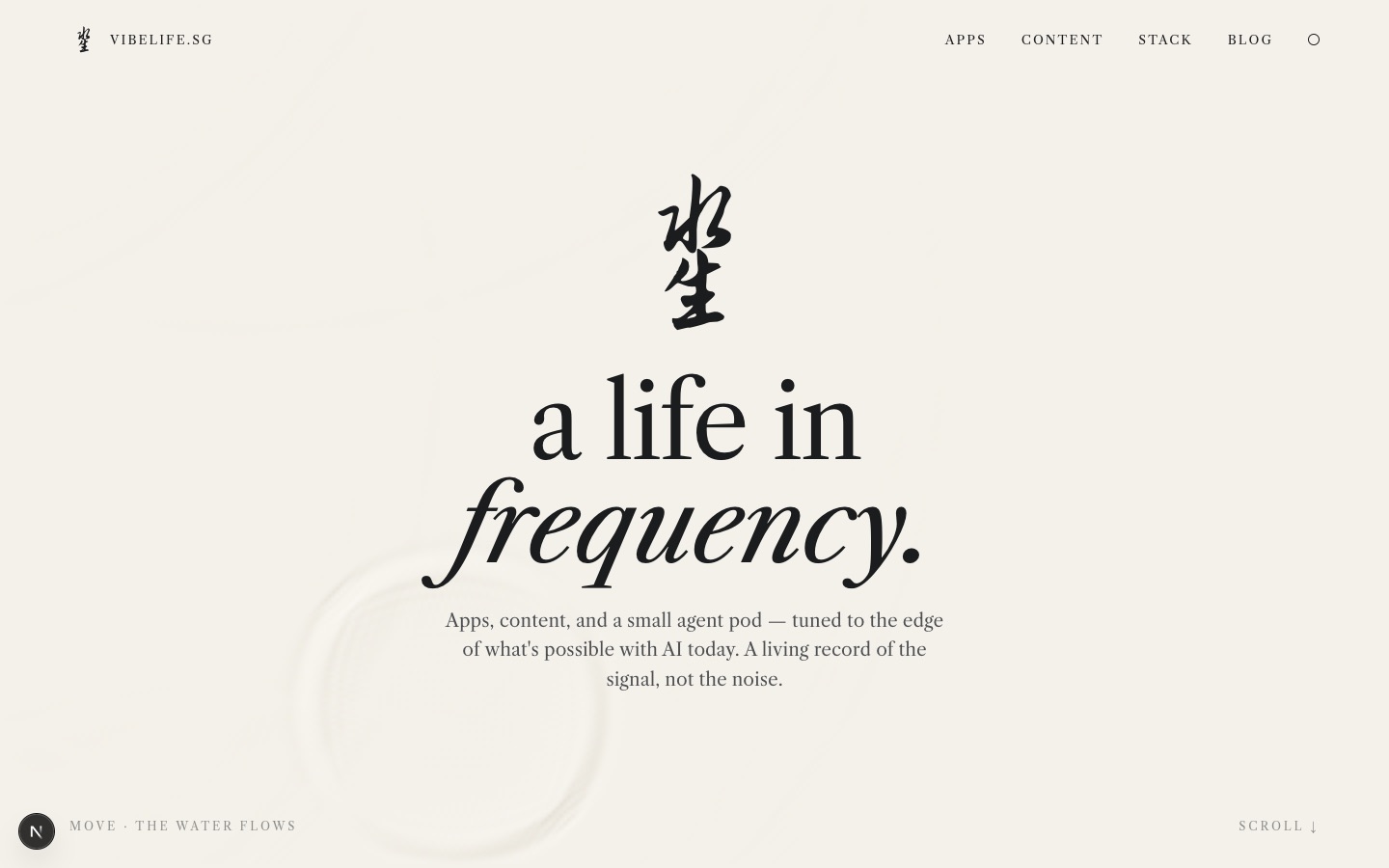
This is how it went from a Claude Design handoff to production code, and what the before-and-after actually looks like.
Disclosure: the design was made in Claude Design and implemented with Claude Code, then reviewed and edited by hand. Screenshots are of the real site, before and after.
Before
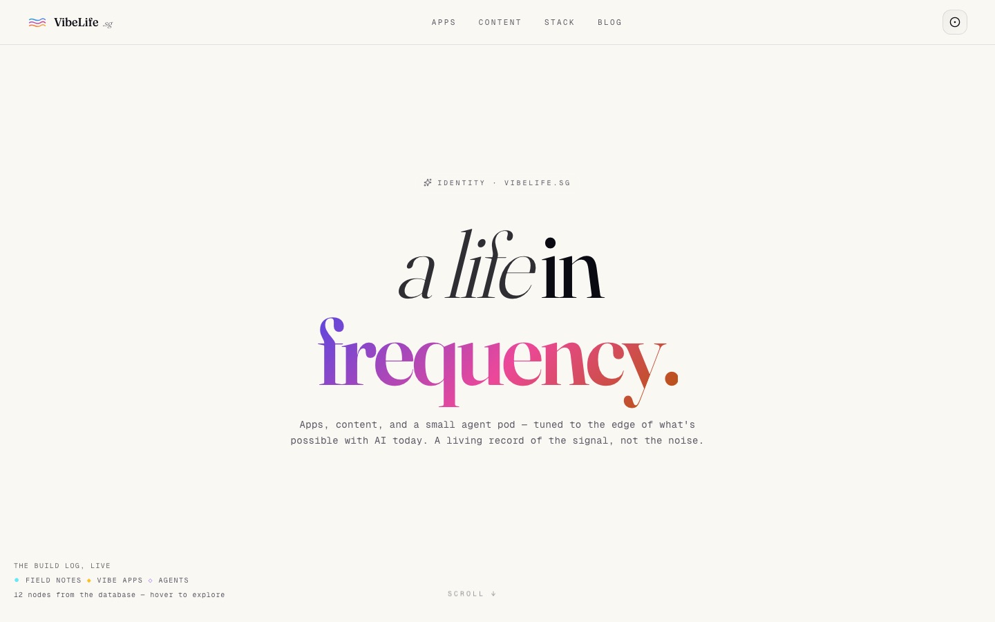
The previous design had a lot going on, all of it tasteful on its own:
| Element | Before |
|---|---|
| Headline | Fraunces with a three-colour gradient on frequency. |
| Hero | A react-three-fiber constellation of posts, apps and agents |
| Cards | Rounded glass, radial hover glow, gradient top bar |
| Labels | Geist Mono, // Vibe Apps |
| Theme | Dark-first, with an auto / light / dark cycle button |
| Colour | Indigo, rose, amber, cyan, violet — plus a colour per blog category |
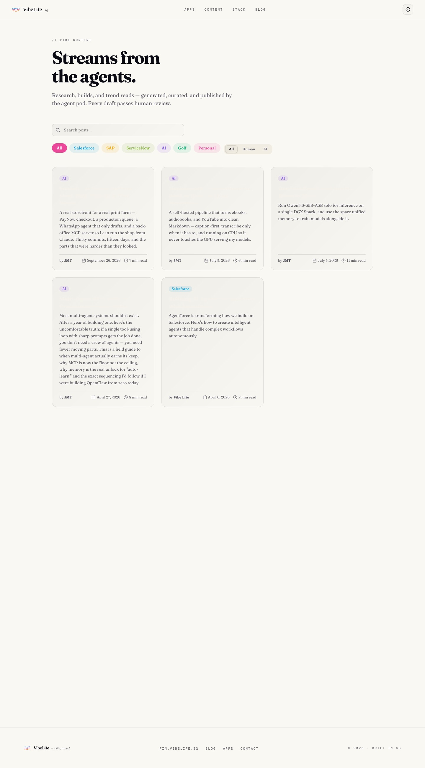
Put together, nothing led. The blog index was the clearest symptom: a search box, seven coloured category pills, an author toggle, and a grid of identical cards.
The brief
The direction in Claude Design was Chinese and Zen — simplicity, generous emptiness, water as the motif. What came out was a concept with a name, a bundle for developers, and very few decisions left open.
The concept, in its own words: an arrival "wow" where a single drop falls onto a still, interactive water surface, the 水生 brand mark surfaces from the ripple, and the title rises. Everything after that is quiet typography with hairline rules and one vermilion accent for seal chops.
What a handoff bundle contains
The export is a zip with four files:
| File | What it is |
|---|---|
README.md | The spec — tokens, type scale, every section's grid, the arrival timeline, responsive rules, state |
VibeLife.dc.html | Home page prototype, runnable in a browser |
VibeLife-Blog.dc.html | Blog index prototype |
support.js | The small runtime that makes the prototypes run |
The README is the important part. It is written for whoever implements it, and it is explicit about fidelity: high-fidelity; colours, type, spacing, copy and motion are final. It is equally explicit about what not to do — the prototypes are "design references built in HTML… not production code to copy", with one exception: the water simulation is plain canvas JavaScript and is meant to be ported as-is.
That split turned out to be the right one. The markup in a prototype is inline styles and template holes; the physics is the only part where re-deriving it would have been worse than copying.
The design system, in one table
| Token | Paper (day) | Ink (night) |
|---|---|---|
| Background | #f4f1ea | #0e1113 |
| Ink | #1b1c1e | #e8e4da |
| Body | #4d4f52 | #b3b0a7 |
| Mist (labels) | #8c8e8a | #6f7472 |
| Seal (the only colour) | #b23a2e | #c9463b |
Type is Libre Caslon Text for everything Latin, Noto Serif SC for Chinese labels and the 一 二 三 row numbers, and Zhi Mang Xing — a brush script — for the 水生 mark. No border radius except on seals. No shadows. The only hover effect on the whole site is a link turning vermilion.
After
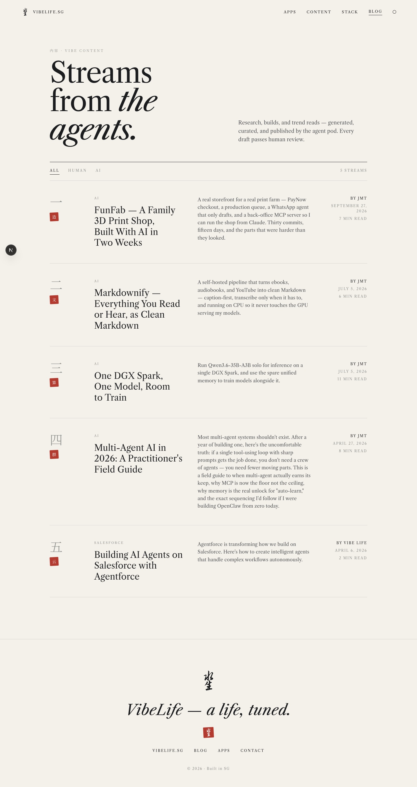
Every app and flagship post gets a seal chop — one character chosen for meaning. VibeFin is 金 (gold), FunFab 造 (make), ServiceNow Sensei 师 (teacher), Markdownify 文 (text), the Scanner 密 (secret). This post's seal is 水.
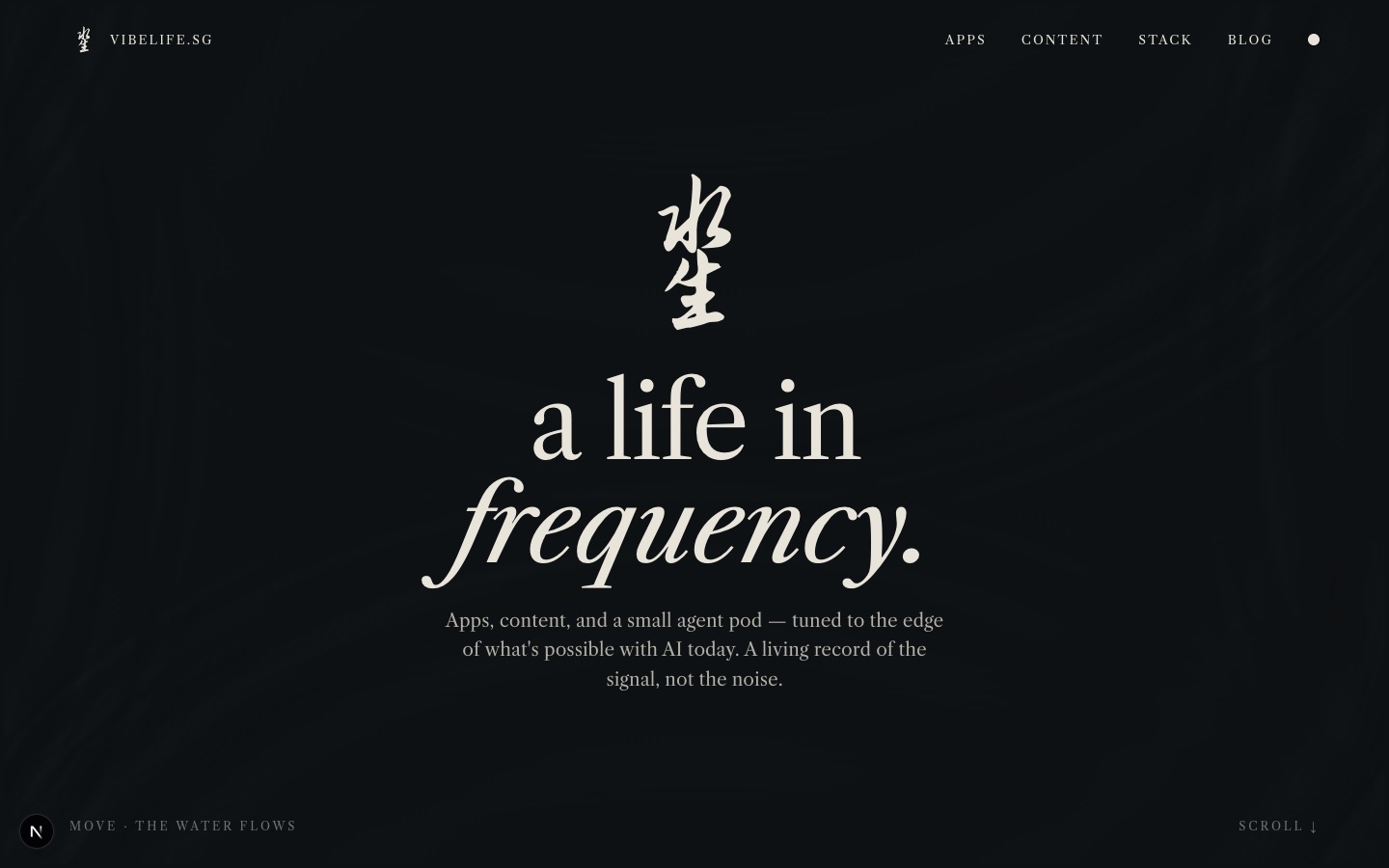
The theme follows the clock — paper from 07:00 to 18:59, ink otherwise — and the small dot in the nav overrides it. The water reads its three colours from CSS on every frame, so switching theme changes the water mid-ripple.
How it was built
Claude Code read the README and both prototypes, then rebuilt each section in the existing Next.js 16 codebase rather than pasting the HTML in. A few decisions are worth writing down.
Alias the old tokens instead of rewriting every page. The site has more pages than the two in the handoff — about, agents, apps, admin. Instead of touching each one, the old variable names (--fg, --muted, --border) and the old brand colours (--color-rose, --color-cyan) now point at the new palette. Every page not yet rebuilt inherits paper, ink and vermilion for free, and can be redone properly later.
Port the water, verbatim. It's a classic two-buffer height-field ripple simulated at a quarter of the resolution, with damping of 0.986. Each pixel is shaded by the local slope, blended toward a crest colour or a trough colour. The React wrapper only adds what production needs: it pauses when the hero scrolls off-screen, cleans up on unmount, and renders a still surface for anyone with reduced motion turned on.
Set the theme before paint. A clock-based theme rendered on the client flashes the wrong colours on first load. A tiny inline script in the root layout decides paper or ink before anything paints, and the React provider picks up from there.
Load Chinese fonts as a stylesheet. Next's font loader self-hosts everything it's given; for CJK faces Google serves around a hundred unicode-range slices per weight. A plain stylesheet lets the browser fetch only the handful of slices the page actually uses — the mark, the labels and the numerals.
Keep the data where it is. Apps still come from the Supabase apps table and posts from posts. The seal characters live in one small lookup file, keyed by app name and post slug, with a fallback by category.

What changed, at a glance
| Before | After | |
|---|---|---|
| Hero | 3D constellation | A drop on still water |
| Mark | Three gradient waves | 水生 — 水 stacked on 生 |
| Palette | Five brand colours + six category colours | Paper, ink, one vermilion |
| Cards | Glass, glow, radius | None — rows and hairlines |
| Blog controls | Search, 7 category pills, author toggle | All · Human · AI |
| Theme | Dark-first, 3-state cycle | Follows the clock, one dot to override |
What's still open
The 水生 mark is a font placeholder. The handoff recommends commissioning a hand-drawn calligraphic version, and the mark keeps the same 100×100 viewBox so a drawn SVG will drop straight in.
The pages outside the handoff — about, agents, the apps directory — are inheriting the palette but still carry some of the old layout. They'll get the same treatment one at a time.
What I'd tell someone trying this
Ask for the handoff, not a screenshot. The README is what made this a one-session job: it resolved every question an implementer would otherwise guess at — exact hex values, the arrival timeline to the tenth of a second, which grid collapses at which width.
Let the design tool design and the coding tool code. The prototype markup was never meant to ship, and treating it as a reference rather than a source kept the codebase idiomatic. The one piece that was meant to ship — the water — shipped unchanged.
Decide what the site is about before choosing colours. The old design had five brand colours because it hadn't decided. The new one has one, because it had.
Enjoyed this post? Subscribe for more.